 11 Tickets
3
11 Tickets
3
Can we reduce the font size of the form?
Can we change it from"add a cart" to "cart"?
Can we remove filter?
Can we remove search bar?
Can we remove Qty?
 11 Tickets
3
11 Tickets
3
Can we reduce the font size of the form?
Can we change it from"add a cart" to "cart"?
Can we remove filter?
Can we remove search bar?
Can we remove Qty?
 2,762
2,762
Hi there,
Is it correct that you are using the "Cream" order form theme?
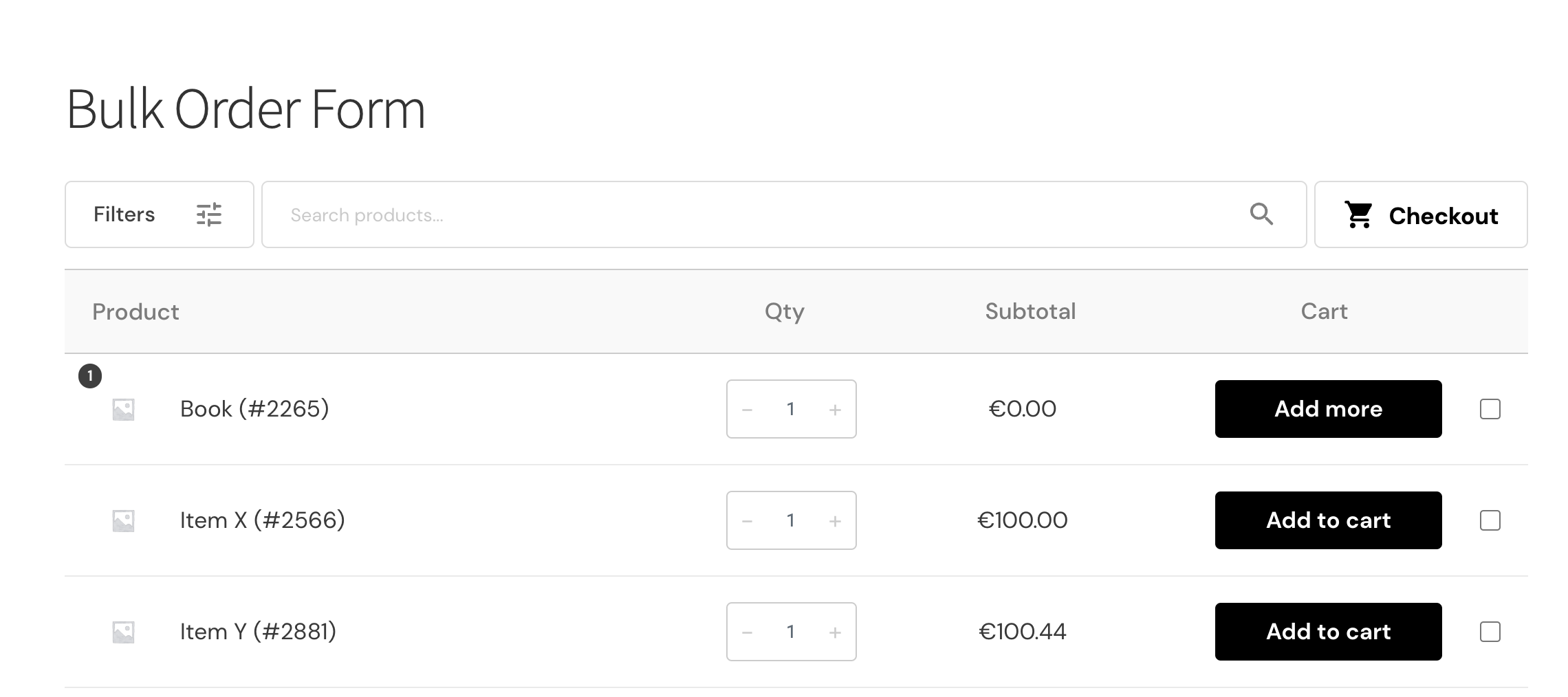
To remove the top bar with filters and search, you can add the following CSS to your site:
.b2bking_bulkorder_cream_header_container {
    display: none !important;
}
To remove the qty, please add:
.b2bking_bulkorder_form_container_content_header_qty_cream, .b2bking_cream_input_group {
    display: none !important;
}
.b2bking_bulkorder_form_container_content_header_subtotal_indigo, .b2bking_bulkorder_form_container_content_line_subtotal_cream {
    width: 27.5% !important;
}
To change the Add to cart text, you can add this PHP snippet:
add_filter('b2bking_cream_order_form_add_cart_text', function($txt){
	return 'Cart';
}, 10, 1);
Regarding the font size, this depends on each element, but in general you can add this CSS to change it for most:
.b2bking_bulkorder_form_cream_main_container_content div {
    font-size: 15px !important;
}
Kind regards,
Stefan
11 Tickets
3
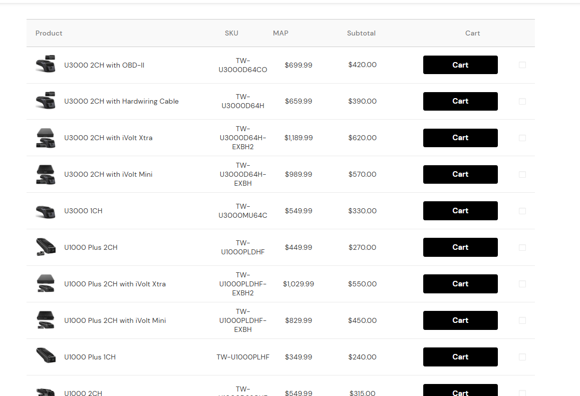
It's working fine. I have one more question.
"Regarding the font size, this depends on each element, but in general you can add this CSS to change it for most:"
Is it possible to set different font sizes for desktop and mobile?
When I adjust it to mobile, the desktop font is big, and when I adjust it to desktop, the mobile font is small. Also, the add a cart button is too big on mobile. Can I make it smaller?
11 Tickets
3
 2,762
2,762
Hi there,
Yes, it's possible to set different font sizes for desktop and mobile using CSS media queries. Here's how you can do it:
/* Desktop font size */
.b2bking_bulkorder_form_cream_main_container_content div {
    font-size: 15px !important;
}

/* Mobile font size */
@media screen and (max-width: 768px) {
    .b2bking_bulkorder_form_cream_main_container_content div {
        font-size: 13px !important;
    }
}
To make the add to cart button smaller on mobile:
@media screen and (max-width: 768px) {
button.b2bking_bulkorder_indigo_add.b2bking_bulkorder_cream_add {
    max-width: 125px;
    font-size: 13px !important;
}
}
Regarding that alignment: It gets a bit complex because it depends on the page width as well as the custom columns.
Can you please share with me a link to that page please and if necessary a login user/password? I would like to check the page directly so I can view its code.
Kind regards,
Stefan
 14 Tickets
4
14 Tickets
4
14 Tickets
4
14 Tickets
4
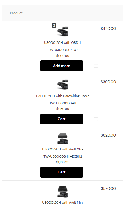
I'm worried because it looks complicated on mobile. For example, there are two amounts. (Of course, the sizes are different, so I don't think it'll be confusing.) Should I just make the SKU a little smaller? Should I make the cart size completely smaller? There's an empty space on the left. Is there a way to make it wider?
I have attached the style I want, so please refer to it
2,762
Hi there,
Normally B2BKing has 2 different styles for the form, one for desktop and one for mobile. However since your site uses that custom column for MAP, it can appear too complex on mobile.
I don't have a way to set it exactly as in the attached screenshot, but we can certainly make some adjustments like reducing the SKU element size, or hiding some elements.
To better assist you it would help to have a link to the page you're looking at. I tried going to https://thinkwaredealers.com/dash-cams/ but it actually appears different when I view it, as in my screenshot below:

14 Tickets
4
2,762
Hi there,
Thanks for providing the site link. Based on your request, here's the CSS code modified to apply only on mobile devices:
To hide the MAP price on mobile:
@media screen and (max-width: 768px) {
    .b2bking_bulkorder_cream_sku span.woocommerce-Price-amount.amount {
        display: none !important;
    }
}
And to reduce the SKU size on mobile:
@media screen and (max-width: 768px) {
    .b2bking_bulkorder_form_cream_main_container_content div .b2bking_bulkorder_cream_sku {
        font-size: 11px !important;
    }
}
These changes will only take effect on screens smaller than 768px width (mobile devices) while keeping the desktop view unchanged. Please add this CSS to your theme customizer or custom CSS section and let me know if you'd like to make any adjustments to the sizing.
Kind regards,
Stefan
14 Tickets
4
thanks
I want to change the title of "subtotal" to "dealer's price."
2,762
add_filter('gettext', 'change_subtotal_text', 20, 3);
function change_subtotal_text($translated_text, $text, $domain) {
    if ($domain === 'b2bking' && $text === 'Subtotal') {
        $translated_text = "Dealer's price";
    }
    return $translated_text;
}
This will generally change the text wherever it appears in any B2BKing context.