 3 Tickets
1
3 Tickets
1
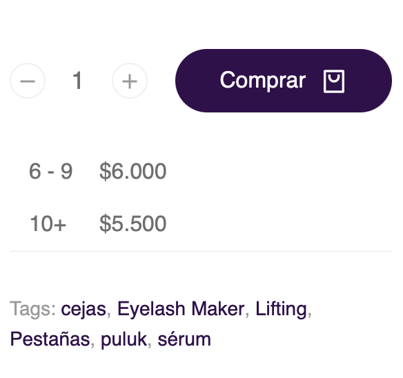
My Tiered Price Table looks different in mobile. There is a way to make it look similar to desktop layout and also the titles disappear?.
 3 Tickets
1
3 Tickets
1
My Tiered Price Table looks different in mobile. There is a way to make it look similar to desktop layout and also the titles disappear?.
 2,762
2,762
Hi Alexander,
Glad to assist,
I checked that now on your site. In my tests, they seem to appear very similar. This is what I see on Desktop:
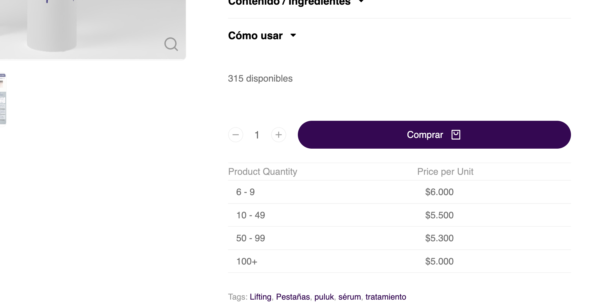
And this is what I see on mobile:
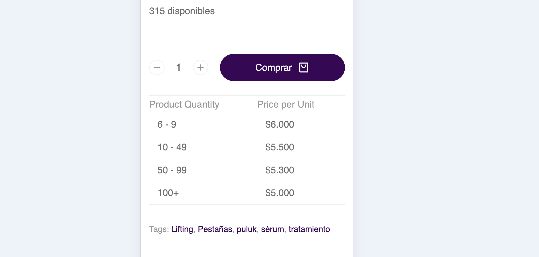
Do these still appear differently to you? It would help if you can share a screenshot of what you're seeing.
Sometimes this kind of issue can be a temporary cache problem. Please make sure to clear all site caches. On your mobile device it may help to also check it using a different device/ browser/ incognito mode.
Kind regards,
Stefan
3 Tickets
1
Hi Stefan, I have to add a css to avoid some changes in mobile versión:
@media screen and (max-width: 640px) {
.b2bking_tiered_price_table.shop_table thead, .shop_table tbody, .shop_table tfoo, .shop_table {
display: revert;
}
}
Otherwise if I leave it by the original styles will look like this:
 2,762
2,762
Hi Alexander,
I see - that's likely a CSS conflict issue. Unfortunately this depends on each individual site and can happen based on the theme or plugins being used.
My solution would also have been to add some custom CSS like you did. If you still have any issues with the current setup or need further adjustments, please let me know and I can look into that,
Kind regards,
Stefan